Take inspiration from some of Australia’s best living spaces, featured in Sunday Life. Architecture and design writer Stephen Crafti, brought two dated homes together to form one impressive designer abode.

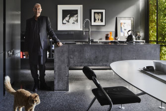
Dark polished concrete floors, a bold concrete kitchen bench and soaring black walls form the dramatic contemporary extension. Credit:Armelle Habib
The home
A two-storey 1930s duplex in Melbourne’s inner east that has been combined to form one home.
Who lives here
Architecture and design writer Stephen Crafti, with his partner and their cat Harvey.

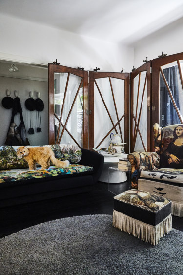
Harvey on a vintage sofa reupholstered by Suzie Stanford. The screen panel is made from salvaged doors and the porcelain sculpture is by Paul Wood.Credit:Armelle Habib
What we did
“We commissioned architect Robert Simeoni to take two separate apartments, and beautifully transform them into an award-winning home that received numerous accolades in 2019,” says Stephen.

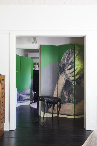
Upstairs, two bedrooms have been converted into large dressing rooms which flank the main bedroom. A large screen artwork by Simon Leah fills the hallway.Credit:Jennifer Soo
My favourite room
“I love the new extension, which comprises the kitchen and dining area,” says Stephen. “I also love the continual play of natural light against the black walls and polished concrete floor.”
The ’hood
“We love going for walks around the neighbourhood, seeing the architecture, both period and contemporary,” says Stephen.

The striking extension of steel and fluted glass creates a dramatic juxtaposition to the original 1930s brick building and its cladding of Boston ivy.Credit:Armelle Habib


 Add Category